

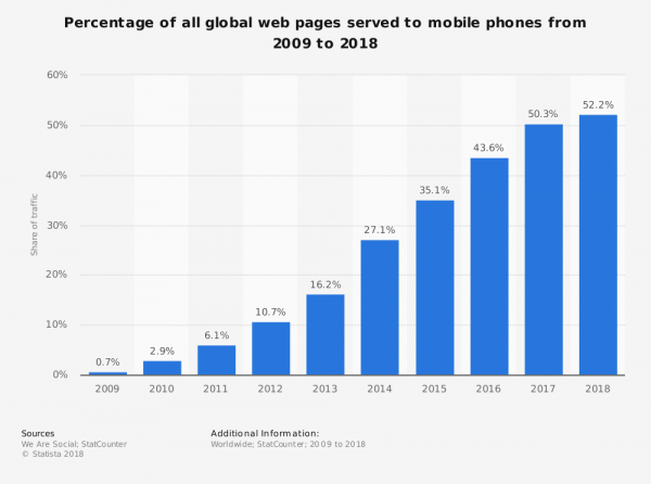
Mobile SEO is the “go-to” SEO tactic right now, especially since Mobile passed Desktop Traffic percentages and Google announced its mobile-first index back in March.
Topics in this post:
To get you up to speed I wanted to resume to top Mobile SEO things you need to know if you are working in the online marketing space.
It doesn’t matter if you are growth marketers like us, a PPC manager or an In-House SEO, the points I mention here are
essential in 2018.
Here’s what you could or should do after reading this article:
If you are involved in an online marketing project, and you work on websites that do not have the mentioned things implemented or struggle, do this:
Try to push the relevant changes through, get the approval, the budget, maybe do a business case or present the necessary changes to your boss. Yes, it’s that important if you care about (mobile) SEO.
Let’s dive into mobile SEO and the top things you should know about:
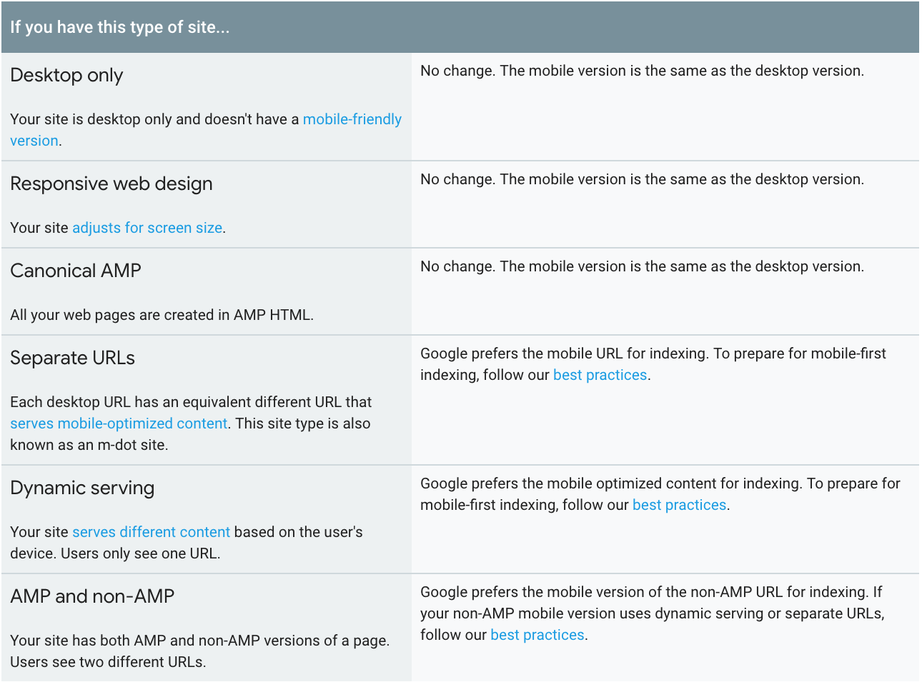
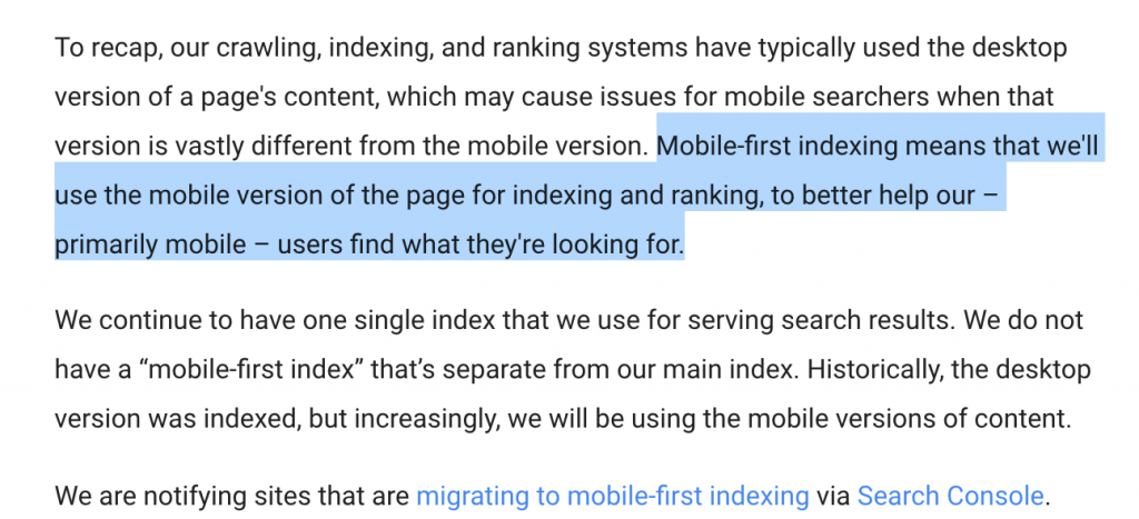
The mobile version of your site is the preferred one for Google
We talked about “mobile first” a lot in the recent years, but now it’s real. Google rolled the first changes out, means it’s happening. In July 2018 there’s another update coming.
If you don’t have a mobile-friendly website in 2018, this might harm our online presence and rankings. In case you have your mobile version located under an “m.” subdomain you should give it more importance now.
The recommended “web design” for websites from Google right now is “Responsive.” It’s a more straightforward, more polished design that adapts according to the screen size and the user’s device.
The design you choose as responsive design should be readily usable on a smartphone.
Make sure that Links and Buttons, Headlines and Images have the correct size when checking for mobile compatibility.
There’s a very cool tool that no other top SEO is mentioning in their mobile SEO blog posts. The tool isn’t handy for SEO but as a mobile testing tool and to check some very Googleish things like “font readability.”
It’s called Lighthouse If you use chrome go to the three dots on the right top, select “More Tools” > Developer Tools and Perform an audit.
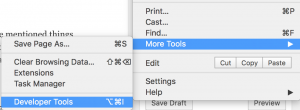
You can even switch between different devices. The original Google tool gives you details and things to fings, no other tool will ever mention. Just have a look and fix what you and your IT team can fix.
Optimize your content for mobile
You need to optimize your content for the smartphone screen!
Mobile screens are significantly smaller than on a Desktop, therefore texts that seem small on a desktop might become very long on a mobile display because text gets truncated.
It’s important to adjust the design and the different elements of the landing page or blog posts according to the needs of the mobile user.
Long paragraphs or non-formatted text am not good.
Adjust your meta-titles and meta-descriptions
The meta-titles and meta-description school shows on the search engine result page of salt up on mobile phones than on desktop devices.
It’s important that when you optimize your meta-titles you keep in mind the mobile user and find it good intermediate solution for both devices if you’re working with a responsive design.
In case you’re working with a specific mobile website dedicated to smartphone and mobile users you might want to consider to create separate titles and meta-descriptions only for the mobile user and adapting length paragraphs and sentences for the small screen.
Should I care about Voice Search?
Yes, Google Assistant, Amazon Alexa and Siri, the voice assistance are everywhere and it’s important to keep in mind these voice assistants when creating content for your website.
Make sure you answer questions in a short precise way so Google can understand whenever you onset to these questions and might even show them in the featured results of the search engine result page.
Answer to questions to help users find relevant content
One of the easiest way to find out the questions users asked about a certain topic is by typing in one question into Google search and if that question is relevant enough Google will present you alternative questions that other users have searched for.
You can also use tools like ants of the public and common tools like SEMRush of lupus addressed to find questions related to your topic.
Start Image Optimization today
Many, many websites use images that are too big. Not only on the blog but also on landing pages.
Let’s say you use a Mac Book. If you take a simple screenshot and upload it to WordPress, it’s way too big. Like honestly, please do something about it. Here’s what you can do if you do or don’t use WordPress (you should use WordPress).
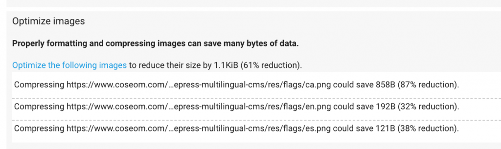
Without WordPress: Make sure to resize images to the size you will use in your content. Safe for web and keep it less than 100kb whenever possible. The Google Page Speed Testing tool gives you the option to download optimized resources and upload them manually to your FTP Folders.
Remember that more than 70% of the population use a 3G connection. To load a Mac Book Retina Image Screenshot may take a while and suck quite a bit. Worst of all, it’ll slow down your website which is terrible for SEO.
I see plenty of blog posts with images that even have the original filename from the photo stock platform. You need to work on all these images before using them online. Try to get a process in place for image manipulation before you publish.
With WordPress: When using WordPress, you can use different plugins to crunch down image sizes to a digestible format for Google and mobile users in particular.
Smush is a free plugin that drastically increases your upload time for each image (if you use in connection with a CDN) but it decreases the size of the uploaded images quite drastically and might be a quick fix to manage the photos you upload the correct way.
Smush also has a function do downsize images you already uploaded.
In case you use a Cache Plugin like W3 Total Cache, you can upload your images to a CDN Server (which can be your Google Drive) without any additional cost.
Depending on the size of your blog or WordPress site it might need some time to do this change, but it’s worth it for the mobile optimization we all need to do.
If you are interested in recent Google Image Search changes, read more about image optimization in this last post
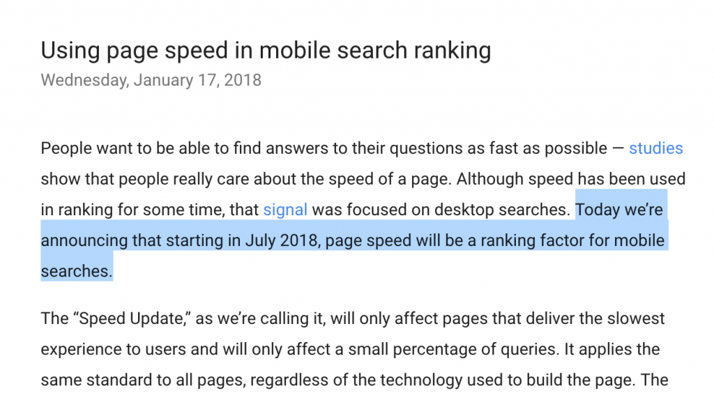
Website Speed on mobile devices is the key to success
There are many ways to improve the speed of your website. While we are or should all be aware of the standard page speed testing tools from Google, Webpagetest.org, Pingdom or GTMetrix it’s essential to focus more on mobile devices now.
What are the two most important Google PageSpeed Insights Metrics?
- First Contentful Paint: This is the time that it takes before a user sees a visual response from the page.
- DOM Content Loaded: This is the time that it takes to fully parse and render an HTML document, ie. the requested page.
Make sure that your website loads lightning fast, even on 3G. Yes, 3G. when did you run a test on 3G the last time? Remember, more than 70% of the users that are not using WiFi are on 3G still. And I think this might not change until 5g and technologies like network slicing.
How to improve website speed in WordPress
Apart from optimizing images, there’s a couple of optimizations you can do in WordPress. The plugin that works best for us is the W3 Total Cache plugin.
W3 Total Cache has much more adjustment options, which makes it a lot more flexible for different setups and installations. LittleBizzy has also a quite interesting collection of low weight plugins for WordPress.
Make sure to decrease server response time. This is a hosting matter, make sure your hosting is fast.
If you work in a Multilingual environment check in Google Analytics if your server responds fast in the countries you target. All the above-mentioned tools for site speed offer options to test speeds from different locations.
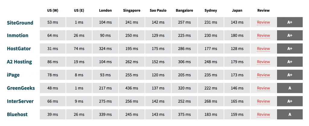
Keep server response times around 0.25 seconds or 200-250 milliseconds and lower if possible. If you really want to digg deeper into website hosting response times You can use a tool like https://www.bitcatcha.com/ to test website host and server response times ONLY.
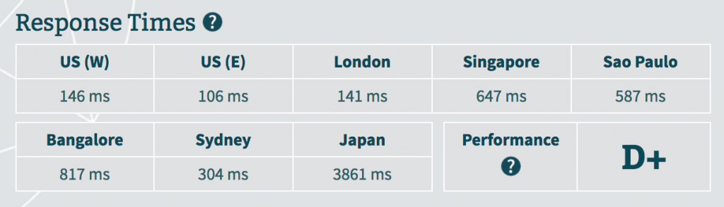
They also have a comparison list of the top hosters and their response times. It’s not ideal for Europe but I still thought it might be very interesting to see.
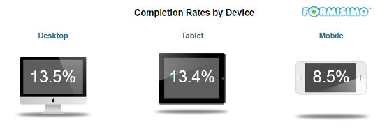
Mobile Checkout Conversion Rate is still much lower than on desktop
The mobile checkout experience is very important. Mobile users like fast loading speeds and easy checkout processes. Long forms, complicated selections or long loading pages during the process will increase the drop off rate of your website drastically.
Learn more about how to create the worlds easiest mobile checkout experience in this blog post by Sleeknote. They discussed some stats released by Formissimo regarding Shopping Cart Abandonment Rate Statistics which are pretty interesting.
12% of shoppers abandon the shopping cart because of a complicated checkout process.
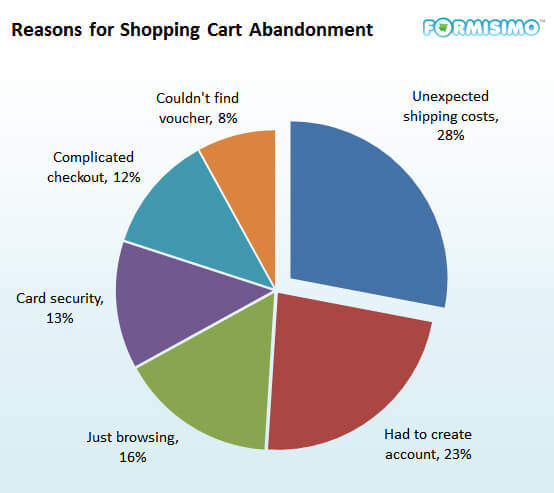
What surprised me most was that the fact that 28% of the shoppers abandon the funnel because of “Unexpected Shipping Costs”. 23% because they had to create an account.
How to decrease Abandonment Rate and Increase Mobile SEO conversion?
In order to decrease abandonment rate from your conversion funnel on mobile and increase conversion for mobile SEO you need to:
- make sure that every step of the funnel is user friendly on mobile
- make sure that every step of the process loads lightning fast
- make sure that you use short forms (shorter than Desktop)
- automatically fill fields in forms where possible
- avoid distractions in the booking process (links to other products, and links pointing to discounts might distract the user during the process)
Takeaway: Apart from making sure that your site loads lightning fast on mobile you need to clearly show shipping costs on your mobile product pages if you are running an e-commerce site and avoid the requirement of creating an account.
Conclusion:
Even though you might not become a top SEO in the coming days these essential mobile SEO tactics will definitely help to increase your website traffic and adapted specifically to mobile use.
From what I see in most projects is very important to actually implement what we have read many articles and this is where most of the websites fail.
The most important thing is to actually tackle the tasks and implement the changes as soon as possible.
Remember the mobile version of your site is now the preferred one for Google. Decrease load speeds and make sure mobile users can navigate with ease.
Start with image optimization today make sure your images are small but have enough quality to represent your products because they also should be downsized to the correct size exactly as they will be used on the website.
Mobile first in the checkout process! Make it easy for the user and show all relevant information accordingly like, for example, shipping costs and other hidden costs. Try to avoid distractions in the buying process and long forms. Also use automation to pull in data that’s already there and automatically complete fields.